Form Widgets
Form Widgets
A widget displays data in a form. You place a widget on the form and choose what data the widget will display and how it will display it. There is a wide range of widgets.
Standard Widgets
These are general purpose widgets for displaying data such as text, numbers or structures
Visualisation Widgets
These widgets are for visualising data as charts or graphs. Their use requires and IJC Viz license.
Common features of widgets
Field binding
Most widgets display data in a form. To do so they need to be bound to one or more fields which define the data that the widget displays. Most widgets display data from a single field, but some use multiple fields. When a widgets is added to the form in design mode you are asked which field(s) the widget is to use.
Size and position
The size and position of the widget in the form can be defined when the form is switched to design mode.
Widget Settings
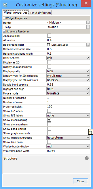
Each Widget has with it an associated set of properties that are customisable by right click on the widget, in design or browse mode and selecting Customise Widget Settings . Many such attributes are shared by all widgets such as font, horizontal and vertical alignment. It is now possible, in design mode, to customise the shared properties of multiple selected widgets in a single "human transaction". You can select multiple widgets, by ctrl or shift and left click or left click on the form and drag to select the widgets. It is possible to select different widget types and the overlapping properties are settable in one go, however this feature might be best employed when update many instances of the same type of widget require configuring. For example to customise the MolPanel widget in detail it is best just to select it in isolation. If you prefer right click approach you will need to make such bulk changes in DESIGN mode. There is also the customise widget button available in the toolbar, which allows you to make bulk changes to widgets in both the DESIGN and BROWSE modes.
Customisable tooltip support
If you want to see structures, names or other data, you can move your mouse cursor above different types of widget and fields. You can read all this information in the associated widget tooltip. This ultimately cool feature is supported by the vast majority of data displaying widgets and by the fields in Gridview. Almost any type of field is displayable in the tooltip. Binary fields and lists are not applicable at the moment. Specification of desired tooltip field is done in Widget Settings window with ToolTip field item. Tooltip is enabled on a widget as soon as you specify which field to use.

Multi-row widgets
Most widgets shows only one row from the database. However, number of widgets can show more records at the same time. There is a few common settings related to this. Widget such histogram or scatterplot are the most complex and have 2 visual layers, background layer and foreground layer. On the background layer all data or nothing can be shown. Foreground layer can show the current results or the selection. Other multi-row widgets (i.e. Radar chart, Table, Molecule matrix) have only one visual layer and the data can be bound to the selection or to the current results.
|
|
|
Format
All widgets allow you to control how their contents are displayed. To edit this open the widget settings editor by either r-clicking on the widget or selecting the widget and clicking on the Widget settings icon in the form view toolbar. Many fields & widgets are now able to support conditional formatting.
Structure based widgets
There are many options associated with the structure based widgets.

Text based widgets
These are Multi line text area, Single line text field and their analogues in Tables, Sheets, etc. It's possible to set foreground and background colours in standalone widget and in Sheets and Tables as well. Because Single line text field can be bound to a number, change of background and foreground colour can be done for numbers too.
Other option available is to wrap text in Multi-line text area.
Number based widgets
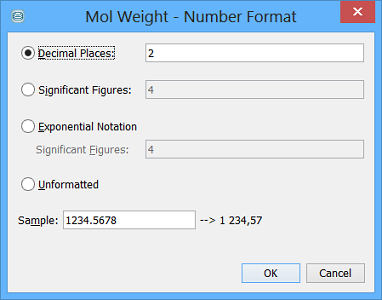
Number fields can be formatted using a notation as appropriate. You can choose to display a set number of decimal places, employ significant figures criterion or display as exponential notation. You could also leave unformatted if required.

Border & Title
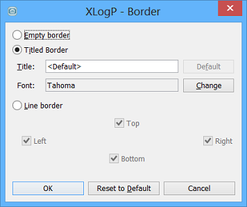
Most widgets have a border that displays the title of the widget (usually the field's name). Various aspects of this border can be configured in the widget settings, and in most cases the border can be hidden. For some of the widgets, e.g. label or panel, also the background color can be defined.


