Data Visualization with Dynamic Charts
Plexus Analysis offers visualization tools to make the identification of trends or interesting compounds in your chemical data set easier. You can, for example, create dynamic charts to see the ditribution of some of the properties of the compounds under study.
At this point, Plexus Analysis can handle:
-
histograms to display the ditribution of a single property;
-
scatter plots with up to five dimensions: X- and Y-coordinates, as well as color, size and shape of data points.
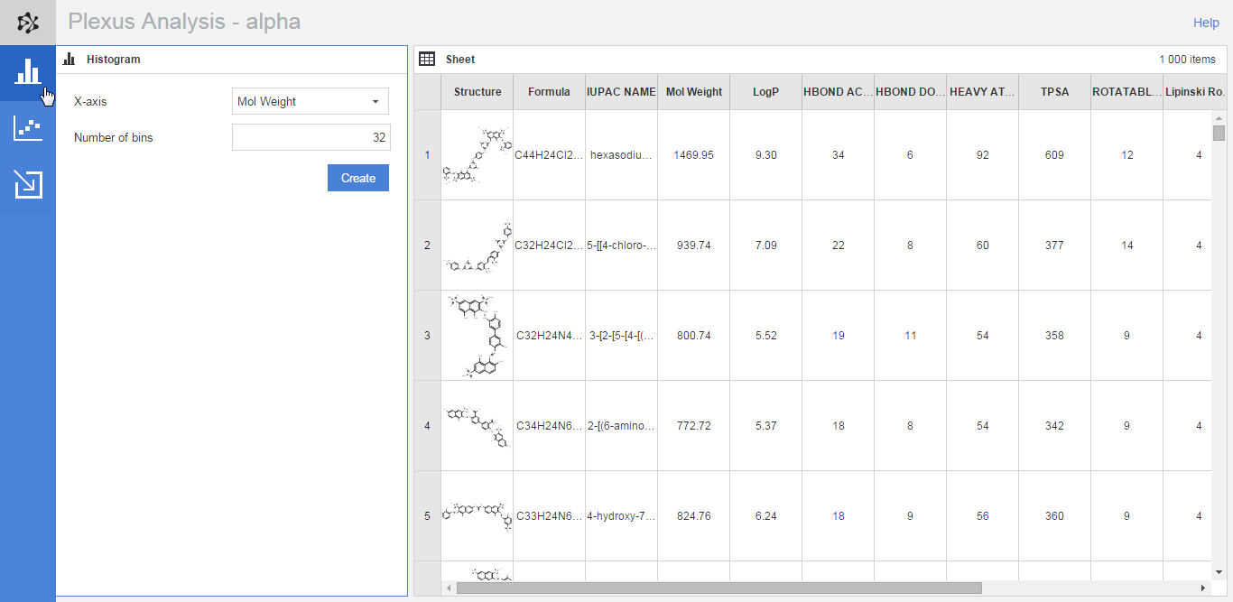
Histogram
A histogram visualizes the distribution of a single numerical variable.
When you want to add a new histogram to your analysis workspace:
-
Open the Histogram panel by clicking on its button on the action bar (on the left side of the application)
-
Assign a numerical property to the X-axis whose distribution you want to study
-
You can also change the number of bins to any integer larger than 0. The default number equals the square root of the number of rows in the spreadsheet (rounded up if necessary).
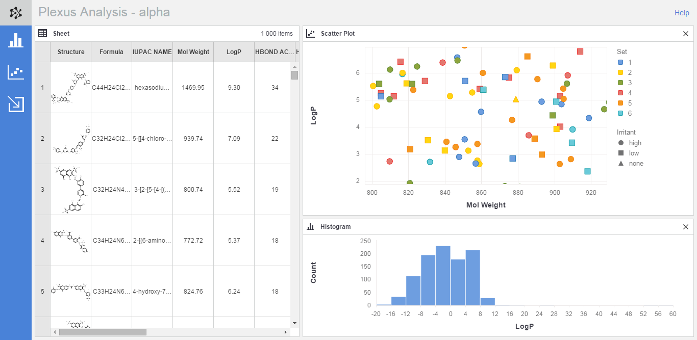
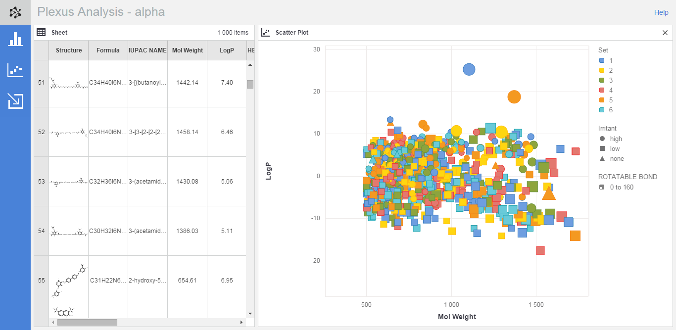
Scatter plot
A scatter plot can handle a maximum of five dimensions: X-coordinate, Y-coordinate, and the color, size and shape of the data points.
When you want to add a new scatter plot to your workspace:
-
Select the relevant button on the action bar to open the Scatter plot panel on the left side of the application
-
Assign columns to the required axes using the drop-down lists: in the case of scatter plots the X- and Y-axes are mandatory.
-
Optionally, you can assign fields to additional dimensions, i.e., to the color, size or shape of the data points.
The rules for assigning columns to the five dimensions of a scatter plot are the following:
-
To the X- and Y-axes you can assign any column which has either numerical or date type data.
-
To the Color dimension you can assign a numerical or a date column, or a category type column which does not contain more than six different values.
When the assigned column -
The Size dimension can handle numerical and date type columns.
-
To the Shape dimension you can assign numerical and date type variables as well category type columns which contain no more than three different values.
Scatter plot legend
The legend of a scatter plot provides information about the columns assigned to the optional dimensions of the chart, i.e., about color, size and shape. Furthermore, it can be used ti change the columns assigned to these dimensions, and to change the color set in a scatter plot.
The fields assigned to the X- and the Y-axis can be modified by clicking on the lable on the respective axis.
You can hide a legend by right clicking on a scatter plot and seelcting the Hide legend context menu item.
Quick chart generation
Histograms and simple scatter plots can be created directly from the database grid views of Plexus Connect:
-
Right-click on a numerical column header in a Plexus Connect grid view and then select Create histogram from the context menu.
-
Select two numerical columns (use CTRL+click or SHIFT+click for multi-column selection), right-click on one of the selected column headers and use the Create scatter plot context menu item.
As a result, a new Analysis workspace will be created in a new browser tab, and the workspace will contain the new chart and a spreadsheet with all the data from the source grid view.
Dynamic charts
In order to give a better insight into the chemical space you are examining, Plexus generates dynamic scatter plots. You can zoom, pan and scale in your scatter plots to be able to study the data set in more detail or to get the most interesting subspace of compounds for a Power Point presentation.
Zooming, panning and scaling work with simple mouse movements and you can easily revert these changes by using the Reset... menu item from the charts's context menu.
See also