Design mode
Introduction
Design mode is where you add the required Widgets to the Form, bind the Widgets to the required Fields and define the layout of the Form. You do not see live data in Design Mode.
A Form, like a painting, starts with a blank canvas. You make your Form beautiful by adding Widgets to it just like the artist adds paint to his canvas. A Widget occupies a rectangular portion of the Form, and has complete control over how its data is displayed within that rectangle. Design mode is the place where this is done. In contrast in Browse mode you view your actual data with the results of your handicraft, but have much less ability to change the design aspects of the Form. You switch between Design and Browse modes by using the toggle buttons on the left hand side of the Form toolbar.
In Design Mode the main activity is to do these 3 steps for each Widget:
-
Add the Widget to the Form.
-
Bind a Field or some Fields to the Widget so it knows what data to display.
-
Position the Widget on the Form to align with other Widgets.
This needs to be done for each Widget you want to use. You can quickly switch between Design and Browse mode to see the fruits of you labour as you progress.
Print guidelines are represented by orange bars. Those lines denotes print margins for original 1:1 printing ratio. If any widget exceeds these margins, whole form will shrink to the size of actual printing area.
Adding a Widget to a Form
In the toolbar:
![]()
you will find icons for each of the Widget types (consult the Widget documentation for details about each Widget). Add the required Widget to its approximate location on the Form using one of these methods:
-
Dragging the icon from the toolbar to the location on the form.
-
Selecting the appropriate widget and clicking on the location on the form. You can de-select the widget by clicking on the Select tool to the left of the widget icons.
-
Right click on the location on the form and selecting the appropriate widget from the popup menu.
Once placed on the form the bind step will commence.
Hint:
You can drop a new widget onto an existing one and the new one will be added in the next available space under the target, and will have the same width as the target. This provides a quick way to create a set of widgets that are "stacked" as a column.
Hint:
If you use the "select and point" approach then you can hold down the Shift key when you click and the current widget will remain selected as the current tool allowing you to immediately add another of the same type.
Binding the Widget to the required Field(s)
The bind dialog is invoked by adding and Widget onto a Form.
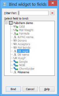
The bind dialog lets you specify the Field(s) that the Widget uses to display its data. Some Widgets require a single Field, others can take multiple Fields.
To bind a single Field: Select the Field from the list and click on the 'Bind' Button. The field can be from any Entity in the Data Tree, but see the section in the Browse mode documentation for how this Field/Widget combination will respond to navigation and selection. The Fields that are presented in the Bind Dialog are limited to those compatible with the Widget type. If there is only a single Field that is compatible with the Widget it will be automatically bound, but you will be notified of this. If no Fields are compatible then you will be presented with a warning message. A Field can be bound to multiple Widgets. Usually this has little purpose, but it can be useful in some circumstances e.g. to present a structure in 2D and 3D representations.
To bind multiple Fields: Widgets can display data from multiple fields. Currently the only Widget that does so is the Table Widget, but it is expected that many new Widget types will evolve that use multiple Fields. The same bind dialog is displayed but multiple Fields can be selected (use Shift-click and Ctrl-click to multi-select) and all the Fields from a single Entity can be selected by selecting the Entity.
Positioning the Widget
A Widget can be re-sized by selecting it and then dragging on its 'handles', the small squares that define its outline. It can be re-sized north, south, east, west, north-east, south-east, south-west and north-west by dragging on the appropriate handle. When the mouse is over one of the design handles the cursor changes to indicate that it will be re-sized.
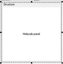
A Widget can be re-positioned by selecting it and then dragging it to its new location.
When re-sizing or re-positioning a Widget the re-sizing or re-positioning can use the 'snap to edge' feature of the Form builder. This means that whenever the edge of an existing Widget (or the west or north edge of the Form) is encountered the re-sizing or re-positioning offers to snap to that location. This is indicated by the dashed blue 'snap lines'. If you release the mouse when the 'snap lines' are showing the Widget will be re-sized or re-positioned to that exact location. This lets you very precisely design Forms that have all their Widgets aligned horizontally or vertically, and allows truly beautiful Forms to be designed!
'Snap to edge' feature can be turn off by switching the toolbar button  .
.
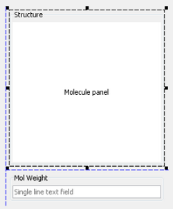
Additionally, group of selected widgets can be elegantly aligned to the left, right, top or down by using these four toolbar icons.
![]()
Customising View Settings
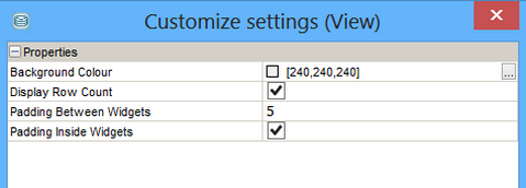
A few customisable properties on a form view can be set in customise view settings dialog. It's accessible under Customize View Settings item when you r-click on the form in Design mode.
-
Background Colour
-
Display Row Count Displays number of structures(loaded out of total) in the left-bottom corner of the form.
-
Padding Between Widgets Specifies the implicit number of free pixels around newly added widgets. This is useful only for offering implicit position against other widgets when positioning them (denoted by blue hatched lines in figure in previous section). It does not apply to already present widgets on the form and there is currently no way how to change this attribute for them in future.
-
Padding Inside Widgets Specifies whether widgets should be padded or not inside the titled border. It's applied to all widgets with titled border only.
Copy and Paste Widget(s)
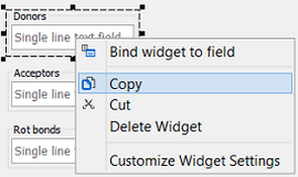
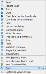
A fantastic feature, is the ability to select and copy multiple widgets on a form in design mode. The user can then paste the selection of widgets on the same form or indeed on to a new form view. It is envisaged that this functionality will reduce the amount of work for organisations that have many forms that overlap in content to some degree. i.e. once one form is completed to satisfaction then a variable portion of that form can be replicated easily whilst retaining all the careful formatting that has been applied to the original. Note : To handle single widget use r-click copy & paste functions and for multiple widget selection you can use ctrl-c and then r-click paste functions at destination.
Adding new Fields
The previous sections have covered how to add a Widget for an existing Field to a Form. Sometimes you might need to create a new field that can be added to a Form. This could either be a Standard Field into which you enter data, or a Chemical Terms Field which will automatically calculate or predict a property for all the structures in a JChem table.
Adding a new Field to a Form is currently a 2 stage process. To add a new Field to a Form:
-
Click in the new Field icons in the Design mode toolbar. The new Field wizard for the type of Field will open. See the Adding New Fields or the Adding Chemical Terms Fields documentation for more details.
-
Once the Field has been added to the database you can add and bind a Widget to the Form as you would normally.
Customising Widget display settings
Many Widgets have display settings that can be customised. You can do this in design mode by double clicking on the Widget to open the settings editor.
Saving a Form
Normally all changes to your form (and grid) view are automatically saved to the Database as soon as you make a change to the design. You need do nothing to save your changes. However in the case of working with very complex forms and/or with a slow database connection you find that the automatic saving of forms is causing unnecessary delays then you can turn autosave off, in which case the form needs to be manually saved when you are finished with the changes.
To turn off autosave: change the setting in the User Settings. You will find it under the Miscellaneous -> Other settings category.
To manually save the form: click on the 'Save' icon in the main toolbar or use the File->Save menu item. These are only enabled when the form needs saving.