CheckBox Widget
Basics
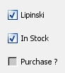
The CheckBox Widget is for displaying Boolean fields, those that have values of true or false. The value is displayed as a checkbox which is checked when true, unchecked when false and greyed out out when the value is null (no value is specified).
It has this icon in the form builder Design mode toolbar: 
A CheckBox Widget can only be used to display a value from a single Field. The Field name is displayed next to the checkbox, and so this widget takes up slightly less space than a TextField widget which can also be used to display the values of Boolean Fields.
Editing values
When editing data you cycle through the 3 different states: true, false and null.
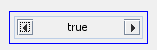
Query mode
In query mode you specify the query term by cycling through the possible values: true, false, null, not null, ignore. You can also specify these using the right click popup menu which you might find easier.