Working with Data in the Grid View
When you import data , a corresponding Grid View is automatically generated for you. The Grid View offers a representation of the table and the data it contains, enabling you to both view and edit the data. Because the View is synchronized with the database table, any edits you make will cause the database table to automatically update.
You can open the Grid View of a table in your project by double-clicking the Grid View node (  ) of a selected table Entity in your project, as displayed in the Projects window. Alternatively, choose Open from the Grid View node's right-click menu.
The Grid View currently supports the following functionality:
The following table lists the Grid View icons and their descriptions. These icons are located in the tool bar found above the Grid View in the main window. Many of these actions can also be accessed from the right-click menu of the column headers row:
|
Icons |
Descriptions |
|
|
Add a new row to the end of the data |
|
|
Delete the selected row(s) |
|
|
Create a new standard field |
|
|
Create a new chemical terms field |
|
|
Create a new calculated field |
|
|
Delete the selected field |
|
|
Send to query panel as new query |
|
|
Add to query panel as new term for the current query |
|
|
Add/remove from working list |
|
|
Create new list using current rows/selection |
|
|
Conditional formatting |
|
|
Customize table widget settings |
|
|
Filter search results |
The grid view has three modes, Browse, Query and Code. In Browse mode you can explore the data whilst in Query mode your can specify criteria for a query and run the query. You switch between the modes using the Query/Browse/Code toggle buttons located in the left hand side of the Grid View toolbar. The Browse mode is shown while opening Grid view, unless initial data retrieval is switched off. In this case query mode is shown instead. The Code mode allows you to customize certain events(like double-click) in the table by using Groovy scripting language. This might be used for a custom input form for a given field for example.
In the grid view you would usually navigate through the data using the horizontal scroll bar and select records using the mouse. But you can also use the navigation tools in the main toolbar.

You can move forward or back, and move to the first or last record by using the navigation buttons. You can jump to a particular record by clicking in the text box that displays the current selection and typing the record number that you want to go to. e.g. to move to the 123rd record click in the box type 123 and hit the return key.
The navigation toolbar has global context. Its contents correspond to the currently selected view. Changing the selected view will result in the context of the navigation toolbar updating.
Sorting Data
Data can be sorted by a particular column, or multiple columns. This can be done using the sort buttons in the main toolbar:
|
Icons |
Descriptions |
|
|
Sort column in ascending order |
|
|
Sort column in descending order |
|
|
Clear current sort directives |
|
|
Open the Sort Table dialog |
-
If you want to sort by field, first select a given field by selecting a value from the column, then click on the Sort Ascending (
 ) or Sort Descending (
  ) icons from the main toolbar. Alternatively you can use the right-click menu of the column header to specify the sort directive.
 -
If you want to sort using multiple columns click the Multi-Column Sort icon (
 ) and specify the sort directives in the Sort Manager that displays.
 -
To clear any current sort directives click on the Clear Sort icon (
 ).
). -
The last used sort configuration is remembered per user.
The sort toolbar has global context. Its contents correspond to the currently selected view. Changing the selected view will result in the context of the sort toolbar updating.
Editing Data
-
Edit a cell by double-clicking on the cell. The value can be edited directly in place or with a pop-up editor, depending on the field type. With in-place editing type in the new value and hit the Return key to commit the change. Hitting the ESC key will cancel the editing and restore the old value.
-
Add a new record by clicking on the Add Row icon (
 ). A dialog appears allowing you to specify the values to add. See here for more details.
 -
Add a new field by clicking either the New Standard Field icon (
 ) or the New Chemical Terms Field icon (
  ). A wizard opens to guide you through the process.
 -
Delete records by first selecting the required rows, then click the Delete Rows icon (
 ). A confirmation dialog lets you confirm that the record(s) will be permanently deleted from the database. See here for more details.
-
Delete fields by first selecting any cell within a given column, then click the Delete Field icon (
 ) or use the right click menu from the column header.
Formatting Table Display Settings
Table display settings can be adjusted according to your needs. Open the Table Widget Settings dialog by clicking the icon (  ) in the toolbar or choosing Customize Widget Settings from the right-click menu of the column headers row. The Table Widget Settings dialog allows you to adjust the column and cell properties of elements within the table.
Typically, each field type has its own display settings options. Of particular note are:
-
Numeric fields: Setting the number of decimal places
-
Text fields: Wrapping to multi-line representation
-
Structure fields:
-
Displaying 3D structures as 2D (3D coordinates are preserved)
-
Display of hydrogens
-
Bond and atom display style For full details of structure fields settings, please view: Marvin Users Guide
-
To adjust table or column properties:
-
Under Table Columns on the left side of the dialog select a field node. Details of the relevant properties display in the right pane. Note that there are two tabs, Visual Properties and Field Definition, which allow you to manage changes.
-
Make any adjustments by entering values for the displayed properties directly into the fields provided.
-
Click close to view changes.
Formatting Table Appearance
You can adjust the Grid View to improve visibility by clicking the button (  ) located in the top left corner of the Grid View. The following menu displays:
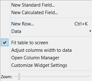
From here you can:
-
Fit table to screen: The table can be instantly fitted to the main window by selecting the Fit to Screen option.
-
Auto-adjust the column widths so that they are more appropriate for the data in each column.
-
Column manager: Opens a dialog letting you easily show/hide and re-order all the columns.
-
Customize widget settings: open the editor for the display settings
-
Resize rows: The height of the table rows can be changed by using the slider to specify the row height. Resizing can also be performed by dragging on the row header boundaries, in the same way that columns can be resized. All rows are resized to the specified size.
Column Manager
The Column Manager provides a simple way to organise the column in the table. You can use it to re-order the columns and to show/hide columns. Multiple columns can be changed in one go, including using drag and drop to re-order the columns.
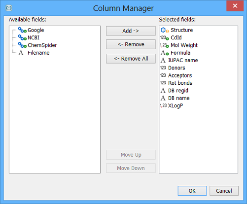
You can also re-order columns by dragging the column heading to a new position.