Data Visualization with Charts
In order to make data analysis easier, you can create different types of charts with Plexus Suite. Currently, the following chart types are available:
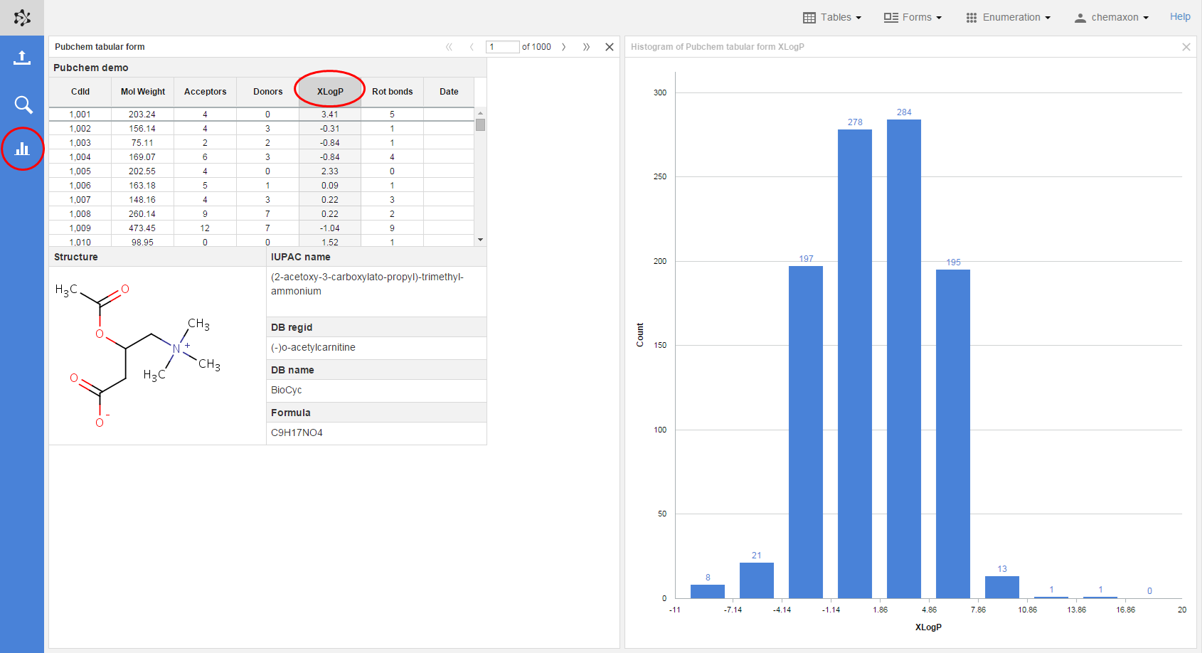
Histograms
You can create histograms to visualize the distribution of certain property values over a table. You can use this functionality to display the frequency of values in the whole table or in a table which was filtered down.
For creating a histogram widget in your workspace, select a spreadsheet column or a field on a form and then click on the Histogram icon on the left action bar. (Please note that this icon is not visible by default, but it appears only when you select an appropriate field/column.) You can add as many histogram widgets to your workspace as you want. They can all belong to the same table or form, or they can get their data from different canvas widgets. The name of the histogram in the widget header contains the property the frequency distribution of which the histogram displays and the name of the canvas widget which was the source of the histogram.
Scatter plots
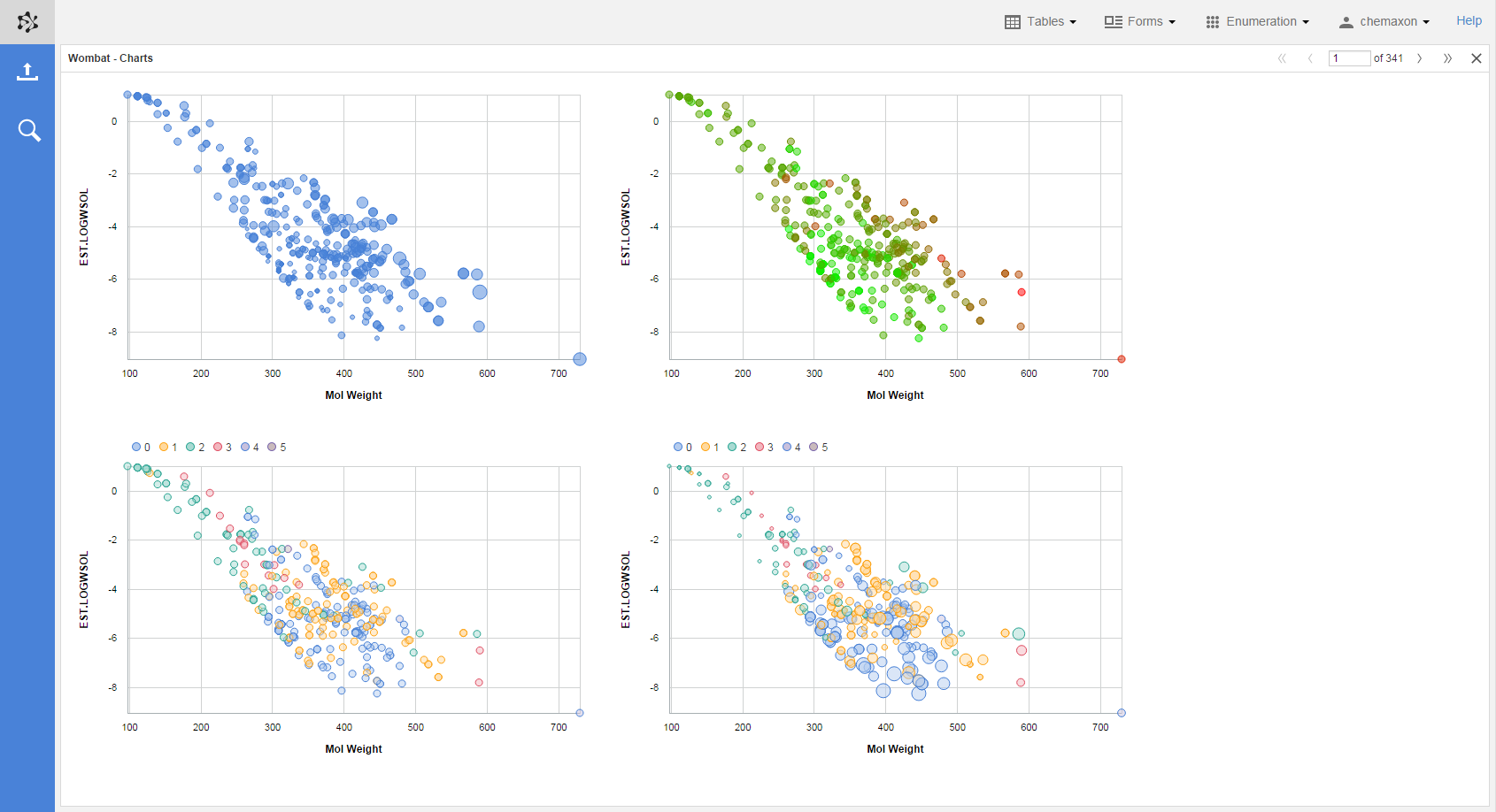
A scatter plot is a useful tool if you want to visualize the dependence of certain properties on each other or when you want to verify some kind of correlation between molecular properties. Scatter plots in Plexus Suite can currently handle up to four dimensions: you can assign a property to the x- and y-axis of the scatter plot, respectively; as well as both the color and the size of the data points in the chart can represent another property, too.
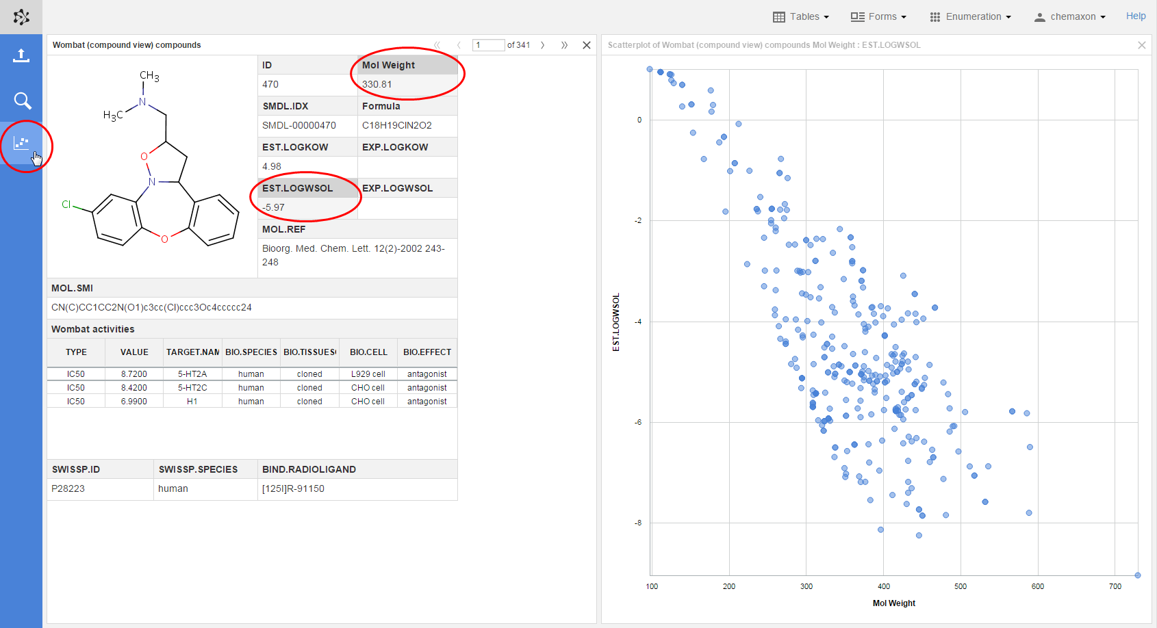
Drawing new scatter plots
Scatter plots created in Plexus Suite can handle two dimension: one numeric property can be assigned to the x- and the y-axis, respectively. When you open a table or a complex form and select two numeric columns or fields (multiple selection is possible with CTRL+click), the scatter plot button will appear on the action bar on the left side of the application. Clicking on this button will create a new scatter plot in a new layout widget. The field selected first is assigned to the x-axis, while the field selected secondl is assigned to the y-axis:
Scatter plots on Instant JChem forms
If you use complex forms which where designed in Instant JChem, you can have scatter plot widgets on them which can handle more than two dimensions: besides assigning a variable both to the x-a and y-axis, the size of the data points as well as their coloring can represent the change of a property. The data point coloring has two subtypes depending on the variable which we want to represent:
-
In the case of discrete (or categorical) variables, such as number of H-bond donors/acceptors, a categorical coloring should be used. When you assign a property to categorical coloring, a legend will also be displayed next to the scatter plot.
-
As for continuous variables, e.g., mol weight, the best choice is gradent coloring, where each value is depicted by a shade between two colors (e.g., red and green).
On the image below, there are four scatter plots with different numbers of dimension. they depict the following properties (in left-to-right, top-to-bottom order):
-
Mol weight on the x-axis, logarithm of estimated water solubility on the y-axis and topological polar surface area (TPSA) assigned to the size of the data points (the larger a dot, the larger the corresponding TPSA value);
-
Mol weight on the x-axis, logarithm of estimated water solubility on the y-axis, and TPSA depicted by gadient coloring (the red dots represent large TPSA values, while the greener ones stand for compounds with smaller TPSA);
-
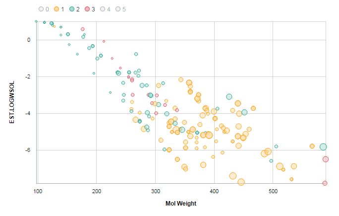
Mol weight on the x-axis, logarithm of estimated water solubility on the y-axis, and number of H-bond donors depicted by categorical coloring. The legend next to the chart displays the corresponding color and H-bond donor pairs;
-
Mol weight on the x-axis, logarithm of estimated water solubility on the y-axis, number of H-bond donors depicted by categorical coloring and number of rings in the molecule assigned to the size of the data points.
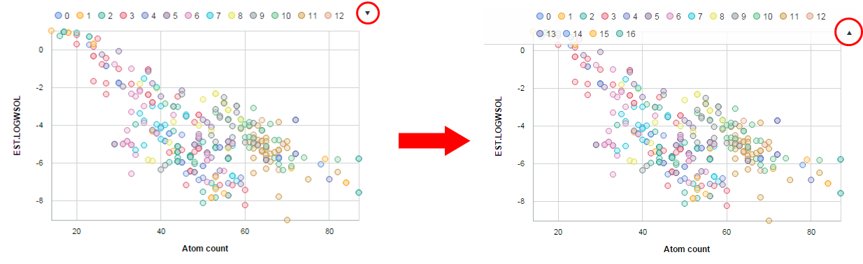
Legend control on scatter plots
When you use categorical coloring on a scatter plot, a legend control will be added to the chart. With the help of the elements on this legend control, you can hide or unhide certain data points on the scatter plot. On the image below, the different colors mean different H-bond donor numbers in the molecules, and data points with 0, 4 or 5 donor atoms have been hidden from the scatter plot.
In the case of longer legend controls, where the points would not fit in one row, a drop-down button is placed at the end of the top row. Clicking on this button will open the full legend control panel.