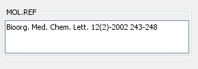
TextArea Widget
Basics
The TextArea Widget is much like a TextField Widget, but is for displaying multi-line text. As such it can only be bound to a Field that contains text. It has extra options for controlling the wrapping of text onto multiple lines, and in Design mode it can be re-sized in the vertical direction, but otherwise it is pretty well identical to the TextField Widget. It has this icon in the form builder Design mode toolbar: 

Settings
To edit the settings in Design mode double click on the Widget and the settings editor will open. In either mode select the widget by single clicking on it and then click on the Widget Settings icon (
) in the Form toolbar. Or alternatively right click on the widget and select Customise Widget Settings item.
Colour customisation
You can also change background and foreground(text) colours. Enjoy this nice feature, it's available since IJC 5.8.
Special option for TextArea widget is to automatically wrap text.
Editing values
When editing values in Browse mode the 'Return' key to saves the changes and the 'ESC' key cancels the editing, just like in the Text Widget. If you are wanting to enter a new line character into the text you must use Ctrl-Return.
Query mode
Text area widget behaves in the same way as text field widget when in query mode.