Label Widget
Basics
The Label widget is the Widget is a simple Widget that just displays static text. It has this icon in the form builder design mode toolbar: 
This widget is for adding labels or other static information to a form.
Since IJC 5.4 image files (e.g. company logos) can also be displayed by the label widget. The size limit is however 50kB.
The sheet widget:

Multi-line text
Multi-line text is also supported. The user should first add a label widget as normal. Then edit the settings and when editing the 'Text' property you can specify muli-line text.
HTML
HTML is also supported. The user should first add a label widget as normal. Then edit the settings and when editing the 'Text' property you can specify HTML into the text for the widget. Only basic HTML features are supported. Some example HTML might be:
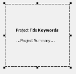
<html>Project Title <b>Keywords</b><br><br>...Project Summary...</html> The label widget with above HTML embedded:
Settings
To edit the settings in Design or Browse mode double click on the Widget and the settings editor will open. Alternatively select the widget in either mode by single clicking on it and then click on the Widget Settings icon (
) in the Form toolbar. The text that is displayed and the font details and alignment can be edited.
Custom URL
Label widget also supports setting up a custom clickable URL for the label. You can set this up when creating the Label widget. The screenshot should be self-explanatory.
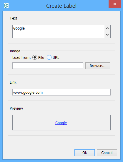
Setting up an image and custom URL will produce a clickable picture. Such as clickable company logo.