Table Widget
Basics
The Table Widget it quite a complex Widget with lots of options. Its basic purpose is to display tabular data. The same component is used in the Grid View, so the behaviour of a Grid View and the Table Widget inside a form is very similar. The real difference is that in the Grid View the table contains all your data, whilst when it is used in a form it usually only contains part of your data. It has this icon in the form builder Design mode toolbar: 
The Table Widget is for displaying multiple rows of data. For master-detail data this can be multiple rows of the master or the detail (but not in the same table!). A set of Fields specify the columns in the table. These are the Fields that are bound to the Widget. Correspondingly the Table Widget, unlike other current Widget types, can be (is designed to be) bound to multiple Fields.
The behaviour of Table Widgets in terms of navigation and selection can be complex when working with master-detail data. Please read the Browse Mode documentation for a detailed description.
Design Mode
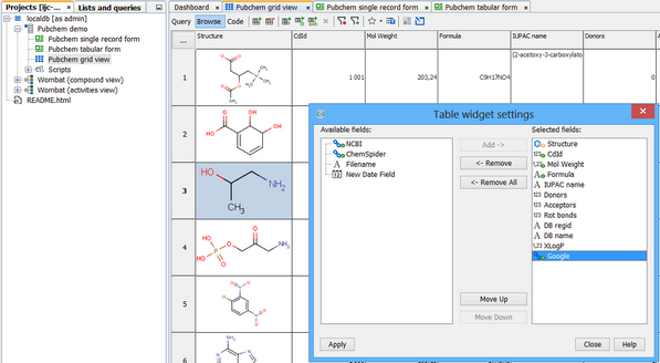
You add a Table Widget to a Form by dragging its icon onto the canvas, after which the Bind Dialog will open. In the Bind Dialog you can specify multiple Fields for the columns in the table, and in most cases they will all be from the same Entity. Use Shift-click and Ctrl-click to make multiple selections. Alternatively, if you want all the Fields for an Entity just select the Entity.
It is possible to bind to multiple entities to the same table widget, selecting different fields from each entity source. This is currently constrained by the relationship type between entities, which must be either 1:1 or N:1 between the entity to be included, potentially in an infinite chain. Currently, inclusion of parent-child 1:N (or N:M) is not possible, but are likely to be in a future release. A use case example, is to compare 2D and 3D structure data sources stored (imported into) different entities which are then displayed in single table widget, for the purposes of comparing computed descriptors. For example, calculations can be applied separately to the 2D and 3D co-ordinates the entities are linked 1:1 based on a common identifier (or perhaps SMILES), one of the entity becomes the root node of a data tree and it is possible to add selected child fields to the parent, using the modify button of the customize widget of the form bound parent entity. Effectively, it is possible to compare sets of row data easily in a "single view" using just one table widget on a form view.
After you have completed the bind process the table will appear on your form, and dummy columns and rows will be present to indicate the Table Widgets contents. You can then re-size and re-position the Widget as normal. Please note the attribute auto-resize row height. If you place this option 'on', then any manual modification to row height will not be persisted on re-connection.
Browse Mode
In Browse mode the Table Widget will display your data. Displayed data can show current results (Data -> Current Results - from the context menu in the browse mode) or selection, usually selected in other widgets bound to current data. Scroll bars will be present if necessary. The selected row, column or cell(s) will be highlighted. This selection controls the display of any other Widgets that are bound to Field from that Entity or any that are from Entities that are from child vertices in the Data Tree. See the documents on Relationships and Data Trees for a fuller explaination of how relational data is handled in Instant JChem.
Data in the Table Widget can be sorted by one or more column values. This operates similarly to the Grid View, and the sort directives are displayed in the column headers.
In Browse mode the columns in the table can be re-ordered (drag the column header to the new location) and re-sized (drag the right hand edge of the column header). The column widths operate in two modes:
-
Fit to width - all columns fit into the available width
-
Actual width - columns use their specified width, and a horizontal scrollbar is used if necessary
To change between these settings use the Size Tool that is accessible from the top left corner of the Table Widget.
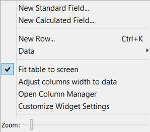
This menu also allows the addition of new fields in the database - standard and calculated fields for all table types, chemical terms for structure entities only.
The row height can be adjusted by using the row height adjuster present in the Size tool, or by dragging on the row dividers in the row header. All rows in the table have the same height.
Show only selected rows
There are two data modes depending on which set of rows you want to see in the Table Widget. Table Widget can show Current Data or Selection. These modes are hidden under Data item in the Table Widget context menu accessible from the top left corner button. Rows selected in other multi-row widget(e.g. scatter plot) can be easily browsed as only those are shown if Data are set to Selection. Selected points within a selection are considered as sub-selection. Selection and sub-selection are automatically propagated among other multi-row widgets. This concept is described in more details on the widgets description page or sub-selection description.
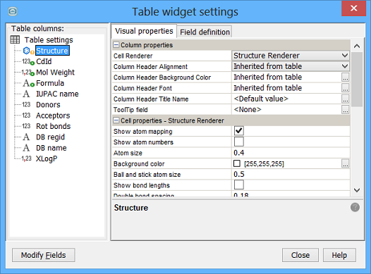
Table Settings
To edit the settings in Design mode double click on the Widget and the settings editor will open. In either mode select the widget by single clicking on it and then click on the Widget Settings icon (
) in the form toolbar. Or alternatively right click on the widget and select Customize Widget Settings item. The settings dialog can also be opened from the size tool (see above).
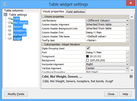
The settings editor lets you control the settings for each column in the table. You can also modify which Fields are bound to the Widget, and hence which columns appear in the table. This can be done in Browse mode.
Query mode
In query mode the table widget behaves very similarly to the grid view query node. A single row is displayed and you can specify query criteria in the cells of this row in a similar manner to the equivalent form widgets.
Code mode
It was introduced in IJC 5.11 as the result of extending form scripting functionality. Here you can customize actions to invoke on given event(eg. double-click) by using Groovy scripting language. It can be used for a custom input form or for additional value viewing processing actions.