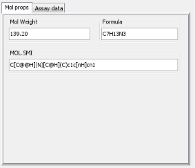
Tabbed Panel Widget
A tabbed panel widget, like the Panel widget , is a panel that can contain other widgets, but unlike the panel widget can have multiple tabs, one of which is visible at a time. This allows a large amount of data to be displayed in a very compact form. Typical usage would be to arrange data into different categories and have a different tab for each category. Then each type of data can be inspected as needed. It has this icon in the form builder Design mode toolbar: 
The Tabbed panel widget:

Adding a tabbed panel widget
To add a tabbed panel widget switch to design mode, place it on the form, re-size it as appropriate, and then add other non-container widgets to the panel. The area used for the content can be larger than the size of the widget, in which case scroll bars will appear, but generally it is better to avoid this as it makes using the forms more difficult.
Move a tabbed panel widget
To move a tab panel widget switch to design mode and drag the border of the widget. This only works for the border region as the internal region of the widget handles events for the widgets the panel contains.
Adding an extra tab
To add extra tabs switch to design mode right click on the region containing the tabs and select 'New Tab'. Provide a name for the new tab.
Renaming a tab
To rename a tab switch to design mode right click on the tab and select 'Rename Tab'. Provide the new name for the new tab.
Reordering tabs
To reorder a tab switch to design mode right click on the tab and select 'Move Left' or 'Move Right'.
Deleting a tab
To delete a tab switch to design mode right click on the tab and select 'Delete Tab'.
Running queries
Switch to query mode as usual and specify the query terms as usual. Terms can be specified on any tab, though obviously not all will be visible at the same time.