Visualisation Widgets
Visualisation Widgets
Visualisation widgets are for displaying data in graphical or visual form. For instance, for displaying the distribution of molecular weight values as a histogram. Examples can be found in the sample project that is included in IJC (File -> New project)
Licensing
For full functionality of visualisation widgets an IJC Viz license is required. For information about this contact sales at chemaxon dot com. Without a IJC Viz license visualisation widgets run in demo mode, allowing only up to 350 data points to be displayed. An IJC Viz license is also needed to enable Conditional formatting functionality .
Visualisation widget types
Currently there are these types of visualisation widget:
-
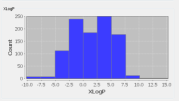
This widget allows frequency distributions to be displayed as a histogram. e.g. a plot of the distribution of molecular weight or logP values.
-
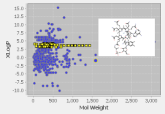
This widget allows one property to be plotted against another as a scatter plot. e.g. a plot of logP vs. PSA for a set of structures.
-
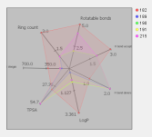
This widget allows multiple properties to be visualised and compared. It is best suited for comparing properties of a small number of rows of data e.g. the selected rows.
-
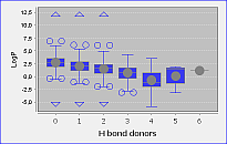
This widget allows statistical characteristics to be visualised and compared. It is best suited for comparing properties among discrete smaller set of groups.


Creation
Visualisation widgets are added to a form by switching to Design mode and adding the widget to the form as usual. All visualisation widgets are added using the same icon in the toolbar  . You choose which widget type as the first step of the wizard that appears.
Common features
This section describes features that are common between the different visualisation widgets. See the documentation for each widget to see the specific functionality for that widget.
Selection
The IJC selection model is tightly integrated into the visualisation widgets, so that the selected values are distinguished from unselected ones where possible. For instance, in a scatter plot or histogram the selected points are coloured differently from the non-selected ones. Similarly, data in the visualisation widget can be selected and that selection is reflected in all other widgets. To select multiple data pieces, it is possible to use Shift+left click.
Sub-Selection
This extends the selection model to the new dimension. If you select points in multi-row widget which shows selection, selected points make sub-selection. Actions like deleting rows or adding to list are applied to sub-selection. In single row widgets first point of sub-selection is shown. Sub-selection is also reflected in other multi-row widgets such as table and other visualisation widgets. Note that in order to show sub-selection, selection must be shown in the widget.
Data and Visual Layers
All widgets support the concept of different data layers, though some widgets only support one layer. When multiple layers are supported the data from one layer is distinguished from that of a different layer. Data layers are hierarchical in nature:
All data
-
This is a layer that contains all the values for the particular entity. Typically this is not shown by default as it can contain too much data, but in some cases it is useful to show this layer so that the current results can be seen in the context of the overall picture.
Current results
-
This is a layer that contains the current results, usually the results of the query you have just executed. It is a sub-set of the 'All data' layer, unless all data is being shown (e.g. no query has been run).
Selection
-
This is a layer that contains the current selection. It is a subset of the 'Current results' layer.
These data layers are usually reflected in widgets in terms of a 'Foreground', 'Background' and 'Selection' visual layer. A particular data layer is applied to a particular visual layer. Which data layers can be applied to which visual layer is dependent on the particular widget type.
Background visual layer is shown in grey colour. Foreground is shown in bright colours and selection is highlighted.
Limit to number of data points
As the number of data points can potentially be very big, the number of points that can be displayed in a visualisation widget has a user specified limit. This is because all data values are typically needed for the widget to display, and retrieving this data can become a bottleneck, and there is probably no real point in displaying charts with huge numbers of points.
This limit can be set for each widget, allowing the behaviour to be adjusted. By default the limit is set to 10,000 rows, but this can be adjusted upwards or downwards as necessary. Where you are accessing a slow network database you may want to adjust the value to a lower level, whilst for local databases you may well be able to use a much larger number without problems. The limit can be changed in the widget settings.
This limit applies to each data layer. So, for instance, with the default settings, if the 'background' layer contained 50,000 points and the 'foreground' layer contained 3,000 points the display of the 'background' layer would be disabled, but you would still see the points in the 'foreground' layer.
Zooming and panning
Most chart types can be zoomed and panned using the mouse wheel, the mouse with keyboard modifiers or the right click context menu. This allows you to zoom in and move around in the chart.
Transfer to other applications
A chart can be copied for pasting into other applications, and can be saved as image files. These options can be found in the right click context menu.
See also: